Burberry has changed its logo for the first time in 2 decades and moves towards a more modern looking logo.
Riccardo Tisci, an italian designer who took up the role of chief creative officer in the month of May had revealed the new logo and the Monogram on Instagram with the hashtag #newera, which indicates that he is definitely taking the brand in a completely new direction.
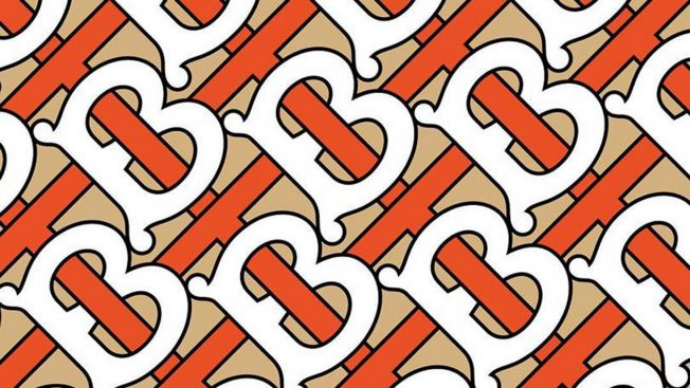
The logo is made up of Thomas Burberry’s initials, “TB” on a honey shaded background. The initials are interlocked and the colors are orange and white. Bodoni font and Equestrian Knight logo is replaced by bold sans serif font giving it a modernized look. This is how it looks like:

The old logo had “Burberry London England” in softer and rounder fonts which are now changed to stark capital letters.
Riccardo Tisci had hired a graphic designer named Peter Saville for rebranding Burberry. Saville is the same designer who had designed the logo of Calvin Klein. There are screenshots posted on Instagram of their conversation for redesigning the logo.
Saville was given 4 weeks to complete the project which was a tough job. He mentioned in one of the mails that it was a 4 month project but he managed to pull it off in 4 weeks. To design the new logo Saville, took inspiration from 1980’s Thomas Burberry Monogram.


After a lot of brainstorming and discussion, this is what they came up with.

Saville told Dezeen, “Burberry needed an identity that is fluid and able to cross over into all the categories that are required of a big luxury clothing and accessories brand–something to transcend the company provenance without denying it.”
The new logo will be used in all the advertising campaigns and Burberry’s channels. It will also be used at the London Fashion week showcase in which he will release his first ready to wear collection of clothing which includes a limited-edition capsule collection which is built on the new see-now-buy-now model which has a new and dynamic delivery cycle.
Just after Burberry admitted burning their unsold clothing stock worth of 28 million euros, they came up with the new logo probably with an intention of redesigning their brand and redirecting it on different path.
This British based brand supported the initiative of H&M and Nike of recycling the clothing in order to improve industry’s record on sustainability.
They gave a statement which said they took the move to protect against duplicate and fake stock being present in the market. There were many consumers who raised their voices against this act and thought it was not a justified move.
A resale site, ThredUp released a letter on Instagram which read “We are in the midst of an environmental crisis exacerbated by the fashion industry. We respect the desire to protect your brand image, but discounting your product shouldn’t be scarier than setting it on fire.”


